

Colours: The Psychology behind 10 – Choosing What’s Right for Your Website
Did you know that simply changing the colour of your copy can change your conversions and sales? It’s true. Colour has the power to affect our emotions. This means choosing the colours for your website is not a black-and-white decision.
In marketing and branding, colour psychology is focused on how they impact consumers’ impressions of a brand and whether or not they persuade consumers to consider specific brands or make a purchase.
Matching Your Niche to the Right Colour
You want your website to fit your niche and audience, right? Some topics lend themselves to certain colours. For example, if it’s a website about love and romance you might use red or purple on the site. Take a look at these popular colours and the emotions they evoke:
Here is a list of some of the common colours and what type of psychological emotion they invoke in people:
RED – Reds are generally associated with love, passion, romance, danger, excitement, action, and adventure. Red is also a great colour if you want to grab someone’s attention. It’s often used in the headline on a sales page. Studies have shown it generated a higher conversion rate than other colours.
BLUE – Blue often represents calmness. It is often used to exhibit a professional image. It’s associated with trustworthiness and success. It’s a symbol of water, purity, and cleanliness.
GREEN – Green often represents money. It also represents sustainable living, health, and nature. Green is another calming colour that symbolizes life.
ORANGE – Orange often represents or evokes creativity, celebration, and fun.
PURPLE – Purple stands for passion. It’s also commonly used to represent royalty, luxury, ambition and fantasy.
WHITE – White is clean. It is simple and it is innocent.
YELLOW – Yellow isn’t a colour commonly used on websites. Yellow can cause people to feel irritated or anxious. However, it can also represent playfulness and fun. Many people associate pale yellow with youth.
PINK – Pink is a soft colour. It’s also a very feminine colour. It’s great for love, baby girls, women’s health and even young girls’ fashion and interests.
BROWN – Brown is an earthy colour. It represents simplicity, matter-of-fact attitudes, and nature.
BLACK – Black, while it can be dark and mysterious, is also solid. It’s a colour that leaves no room for doubt.
Do the colours on your website presently support the image you want to portray? Do they have the desired effect on your prospects and visitors? If you’re unsure, consider making minor changes and testing and tracking results. Test the colour of your headline. Test the colour of your background. Test the colour of your forms too.
Our Flourish & Grow to CEO brand colours include purple (Pam’s favourite), pink (Jane’s favourite) with a little blue and cream to balance them out.
Passion and ambition are the distinguishing factors that Pam strongly identifies with. When she has a project to work on for instance, passion is often the driving factor and ambition keeps moving her forward.
For Jane, the feminine side of pink is where it’s at. She’s girly, sassy, but also savvy. (You won’t catch Jane leaving the house without mascara and lipstick!)
The blue we use for us, signifies trustworthiness and professionalism. Although we like to have a lot of fun, the heart of our business is to help our clients grow their businesses to $100k and beyond. And the cream (a variation of white) allows us to convey the simpleness of our processes.
Colour has a dramatic effect on emotions. It can motivate, inspire, and touch. Take advantage of the effect they have and use them on your site to help you achieve your goals.
Here’s an interesting chart, called the Color Emotions Guide from Visually:
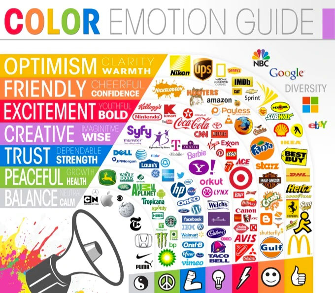
Explore more visuals like this one on the web’s largest information design community – Visually.
Leave A Comment